Introduction

Kid Nutrition App
I created a conceptual dedicated app and responsive website while completing my Google UX Design Professional Certificate. The goal was to design a cross-functional app to teach kids about nutrition.
Role: Individual role; UX researcher and designer
Time: August- October 2022
Tools Used: Pen and paper, Figma, Google sheets, Google forms
DESIGN THINKING PROCESS
Empathize
Ideation
Define
Ideate
Prototype
Test

INTRODUCTION
A local Atlanta non-profit, focusing on child well-being, recently obtained a grant to create a nutrition app to educate children on healthy eating.
Parents want their children to try new and different foods to increase variety in their diet and encourage healthy eating patterns.
Problem
Create a fun, educational app that provides an introduction to, information on, and encouragement around, different foods.
Goal
EMPATHIZE
I conducted foundational research to learn about the users I'm designing for, gathering feedback on their perspectives about nutiriton.
The most current research is beginning to make clear that while digital media can provide significant learning benefits for young learners, the adult-child relationship is essential to obtaining these learning benefits.
Methodology
1

For my initial survey to understand the user, I conducted remote, unmoderated studies with 5 people . I decided to utilize this research method to ensure it was accessible to our target audience.

2
Empathy Map
Using qualitative data, I mapped what the user says, thinks, feels and does to identify pain points around nutiriton with kids.
The main group that was identified was parents who wanted their kids to fuel their body with healthy foods. Many parents want their kids to eat a varied, healthy diet, but tend to avoid the word “unhealthy” when referring to food.

3
Persona
Taking what I learned from empathy mapping, I created a fictional persona that represents potential users.

4
User Journey
Mapping Matthew’s user journey illuminated the need for several specific considerations to account for in the cross-functional platform: getting children interested in food before they get to the table to eat, finding a different way to engage children beyond saying a food is good for them, and ways to involve parents in the learning so they have tools for success.

IDEATION
Taking these user needs into consideration, I began the brainstorming process to find feasable, desirable, and viable design ideas.
1
Competative Audit
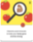
The goal of this audit was to understand the various products and features currently available in the marketplace and to see how some or all of those features educate and encourage healthy eating habits for kids.

Have a website that has a section for kids and adults with tailored information
Opportunities
Have pictures of foods with nutrition info
Optimize website and app for accessibility: large/high contrast text, offer in other language, images paired with text, helpful images
Balance having helpful information without being too wordy
Increase brand identity
I began the process of designing the dedicated mobile app with several rounds of crazy 8s.


Knowing what I learned about children as users, I wanted to make sure I included important design elements, like reduced scrolling, lots of images, and a navigator to guide the child through the app. Key elements I wanted to use were highlighted with a star.
2
Created a User Flow
Using a progressive enhancement method of design, I began the cross-functional product with the dedicated mobile app.
After research and thinking about how to best serve the whole family as users, I decided that the dedicated app will be child-focused while the responsive website will be a companion site for adults to access resources, education, recipes, and information on the app.

3
Created a User Story

PROTOTYPE
Using what I learned about users, I began the design process of the dedicated app.

1
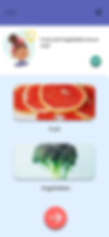
Paper Wire Frames
I began with paper wireframes to ensure we included all the needed elements. I wanted to have a navigator take the child through a learning food journey with a reward at the end.
2
Digital Wire Frames
Using Figma, I transformed my paper wireframes into digital wireframes. During this process I made some design changes and added additional information and images.


3
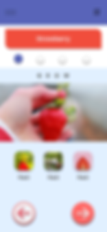
Low-Fidelity Prototype
I added interactions to my low-fidelity prototype so I could complete a usability study with users.
TEST
I conducted a moderated usability study with two children and one adult. I wanted to get information on whether the app was appealing to children and if parents would want their child to use the app. I found that children were confused about the pared down version of the app and most comments were made in regards to it not having color and pictures. The following findings do not include those comments.
Parent Quotes
"No. I think maybe I would like to see more stuff- more content on why its important to eat this."
"The actual word grow is confusing. Is it about fruit or science."

Child Quotes
"Um. Head. Arm. Waist. Leg. I don't know. Make the person on all of them have a face."
"Make go button green and make click sound."

1
Navigation buttons need to be more clear.
2
More food facts need to be presented.
I synthesized all the insights and came up with the following priorities:
3
The text regarding how a food affects your body needs to be more descriptive, larger in size, and include images.
4
Text and buttons need to be supported with sound.
5
Expectations for the site need to be presented at the beginning of the app.
REDESIGN
Following the usability studies, I took the information gathered and began iteration on my designs.
Mobile Mockups
Before

Before
Before
After

1
Priority
Expectations for the site need to be presented at the beginning of the app.
Design
Change
Added statement to homepage of app.
After
2
Priority
Navigation buttons need to be more clear.
My initial design transitioned from the home page to a page allowing a child to pick whether they wanted to pick a fruit or vegetable.
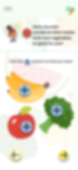
My revised design had several changes. The navigation bar color was changed, lightening the feel of the page. I also
added a page with information on why fruits and vegetables are good for you. The child can click on the plus sign for a pop-up fact.
Design
Change
After

3
Priorities
Text and buttons need to be supported with sound; More food facts need to be presented.
Design
Changes
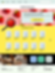
My revised design included additional elements, like what the fruit looks like on the inside, how it feels when you touch the outside, and other interesting facts. To add an interaction element, when the child taps on the plus sign, a pop up fact appears.
Additionally I have a button so the child can click it to have text read to them.
While it cannot be shown on the mockups, I would also add sounds to the buttons, so when a user presses a button, it would make a "click" sound to acknowledge they pressed it.


Accessibility Considerations
1
2
3
Combine text with images
Text reading sound button
Different size font for visual hierarchy


.jpg)

RESPONSIVE WEBSITE
DESIGN
1
Site Map + Paper Wireframes
I wanted the responsive website to be more parent-focused so I created a new site map, and began the process of progressive enhancement design.
I briefly sketched a few of the pages I wanted to design, but most of my work was done in Figma, using the dedicated mobile app as a foundation for information and layout.

Mobile Responsive Wireframe
Desktop Responsive Wireframe
2
Digital Wireframes
Using Figma, I transformed my paper wireframes into digital wireframes.
I focused on how the layout, location of cards, and text/image size would change based on the differing screen sizes.

Mobile Responsive Wireframe
Tablet Responsive Wireframe
3
Low-Fidelity Prototype
The next step was adding interaction to my design, creating a low-fi prototype.
Due to the heavy content of this fictional site, there are many pages that have not been designed. The user must navigate through the site using the navigation bar and menu.

REDESIGN
For this project I did not complete another usability study after creation of my responsive website. The following sections have changes I made to the design after iteration, and considering information learned in the course materials to address accessibility and design practices.
Before
After


1
I changed the design to include an option for the parent to download the app. I also wanted to add a large hero image of a parent and child, mirroring the focus of the site.
2
I wanted to make the design less busy and add more white space. I also included more images to reflect the content of the page.
Before

After

Before
After

3
I wanted to add more white space to the page, so I eliminated the color under the book section. I also wanted to include additional content at the bottom of the page.
4
High-Fi Prototype
The next step was adding interaction to my hi-fidelity design.

Final Mockups


Accessibility Considerations
1
2
3
Combine text with images
High contrast text
Different size font for visual hierarchy

FINAL THOUGHTS
Impact
This app has the potential to positively impact children and families by increasing food knowledge and encouraging good food choices.
This app can educate children about food in a fun way that encourages healthy eating, knowing why we need to eat certain foods, what to expect when eating a specific food, and how you can be involved in the process through recipes.
This responsive website has the potential to positively impact children and families. By empowering parents to get involved in the technology their children are using, children will have a greater benefit from using the app.
Takeaways
1
Focus on User Needs
Unlike my other projects, this was based on children as the user. This different user group required additional research, the ability to be creative and flexible during the usability study, and reiterated the importance of focusing on designing for all.
2
Kid Friendly Design Principles
Kids as users require their own set of design needs. While I did some research on best practices, this is an area I am interested in learning more about.
3
Challenges Changing Platforms
Making the transition to a responsive website from the dedicated mobile app was challenging. I decided to change the user perspective from a child to an adult, supported by research on the importance of parent involvement in child technology use. This allowed me to tap into my background in parent education, ensure the needs of the user, and practice progressive enhancement design. I wanted to ensure the look and feel of the site was similar to that of the app, and included areas that would support the content of the dedicated app.